Sports Design
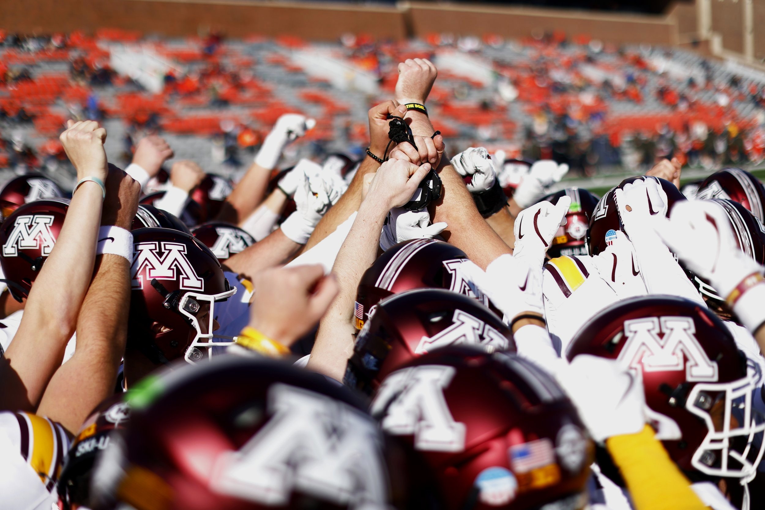
UMN football
Objectives:
My main responsibility within this position, was to utilize templates and photos to create designs for social media (primarily Instagram.)
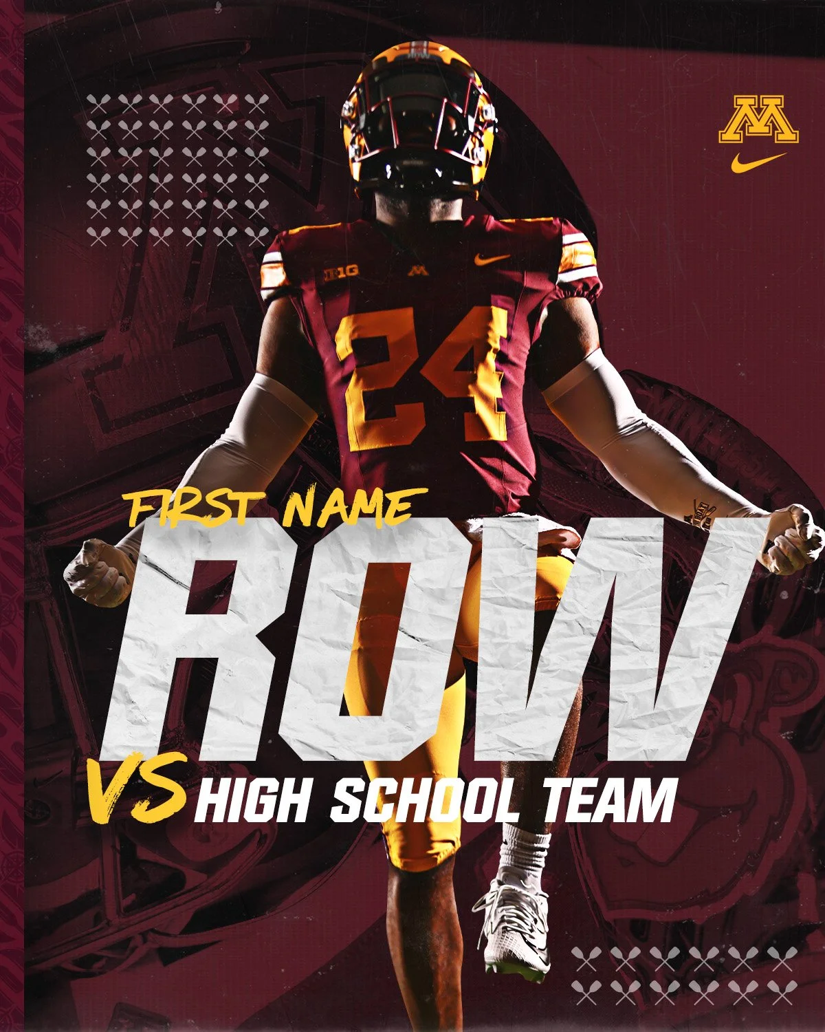
-These Row designs were for a recruiting post made each week by the Gopher social media team
-Sent to high school recruits who are about to play in big games and is customizable to change their number and skin tone.
Strategies:
-Give it that hectic college football feel with a unique type and exciting background
-Used a bunch of different models as well to change up the main pose and tone of the design
-Also utilized motion blur often to get that dynamic movement feel and tried to represent Minnesota often through gradients and color schemes within the background


Font Choices

Logo Usage


Giannis Antetokounmpo
Objectives:
This poster was a gift for one of my cousins for Christmas and represents the fantastic Giannis Antetokounmpo.
-Focus on more clean elements and dynamic movement
-Create dramatic representation using desaturation and consistent colors
-Highlight the Buck’s color scheme using topographical lines
Strategies:
-This was the first poster I experimented with creating masks around the players actual uniform.
-Made the design more unified and focused on the overall jersey colors
-Focused on clean geometric look with square frame and some slight breaking to add a sporty feel'
-Used textures to create border which helped give great base to design
-Demonstrate the layers that Giannis has had throughout his very unique career with elements building on top of one another


Lando Norris
Objectives:
-Passion piece to practice more restrained formatting compared to my other sports posters.
-Created dynamic flow within the piece using F1 Font and angular vectors.
-Used pictures of Silverstone to depict his home race and give some context to Lando as a person.
-Used images of him smiling and his crazy basketball helmet to represent his driving style and personality.
Strategies:
-Using various angles with vectors going in opposite directions to create that racing feel.
-Included Lando’s car going in the opposite direction to give a huge feeling of speed.
-Background and layering created depth and added a new dimension to the design.
-Lando breaks the formatting on top which creates more depth.


Rowdy Tellez
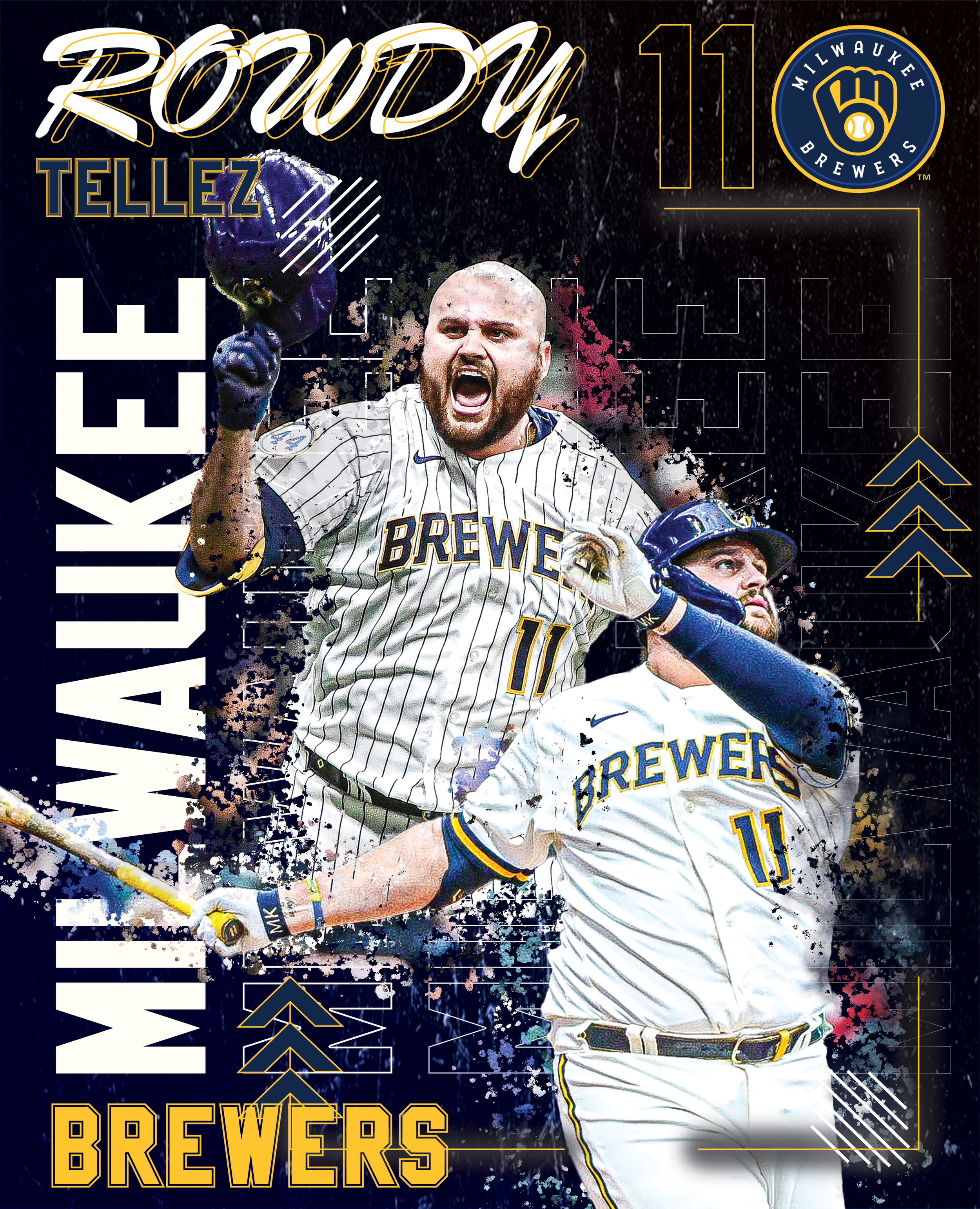
Objectives:
This poster is a representation of an old veteran who is known for his explosive temper and hitting ability, Ryan John "Rowdy" Tellez. This poster was an experiment for me as I focused a lot on trying new vectors, software tools, and backgrounds. The splatter stayed of course though because I love how it adds a unique texture to any poster. I wanted to create a lot of dynamic movement throughout the piece so I used different vectors and shapes to draw the viewer's eye around the page.
Strategies:
Using masks I created the splatter effect with the background of these images appearing through the background. This allowed more color through the piece and gave some depth to Rowdy's poses. I then made some vector shapes to give a sporty feel and create a clean background around the main composition. Coupled with outer glow neon lights and logos from the Brewers this design came together very well.
