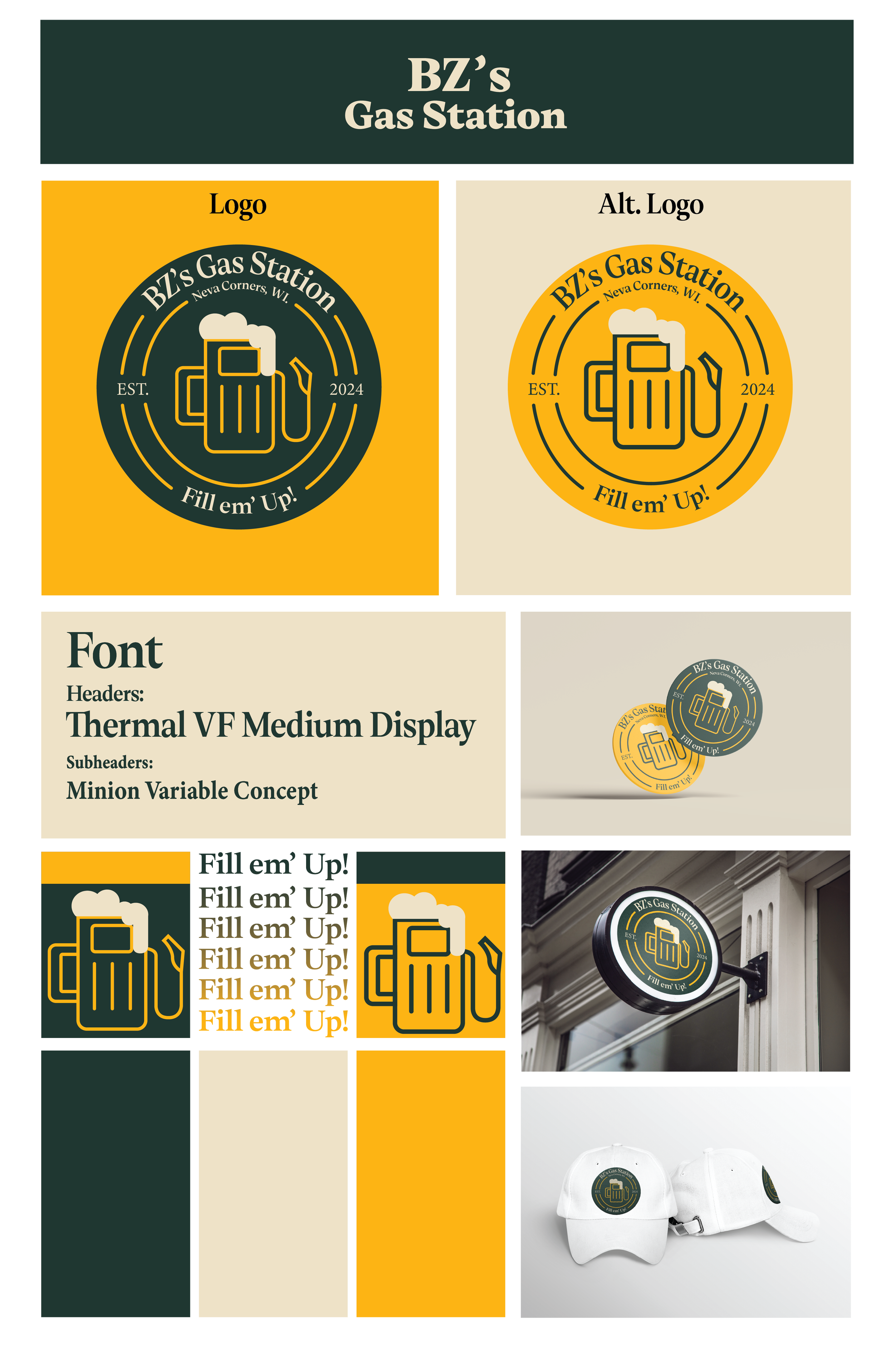
BZ’s Gas Station
Objectives:
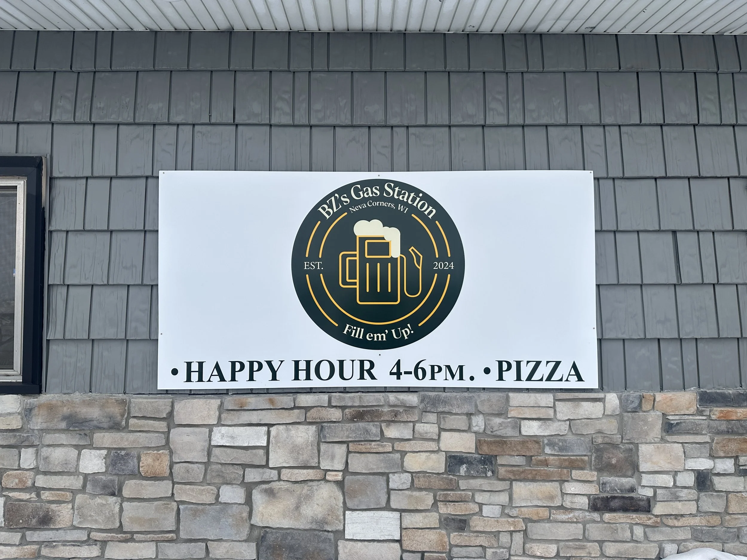
This project was for some family members that recently purchased and rebranded a bar. The only direction they gave me was their name, slogan, and some various color scheme ideas. This was very challenging but also gave me substantial creative freedom. I’ve seen various bar logos and wanted to keep a similar tone while creating a new and clean decal that they could utilize anywhere. They ended up using this logo on the signage and various collateral (shirts, quarter-zips, etc.) Overall, a super cool chance to work with a new client and execute an effective design.
Strategies:
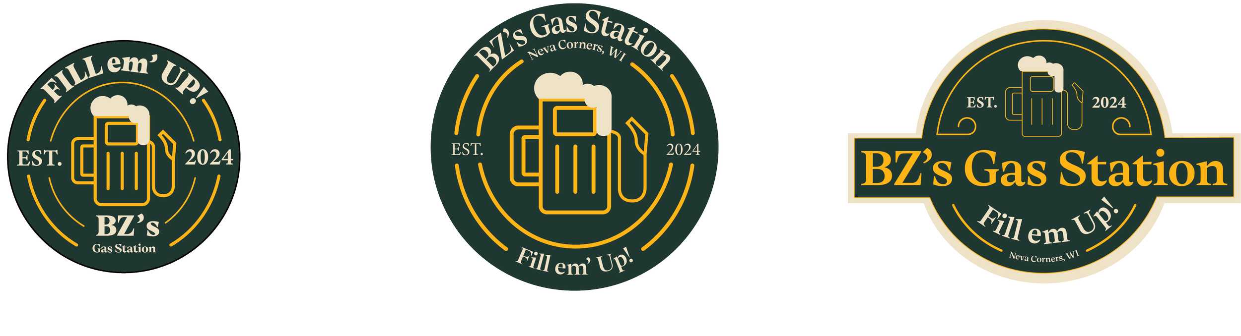
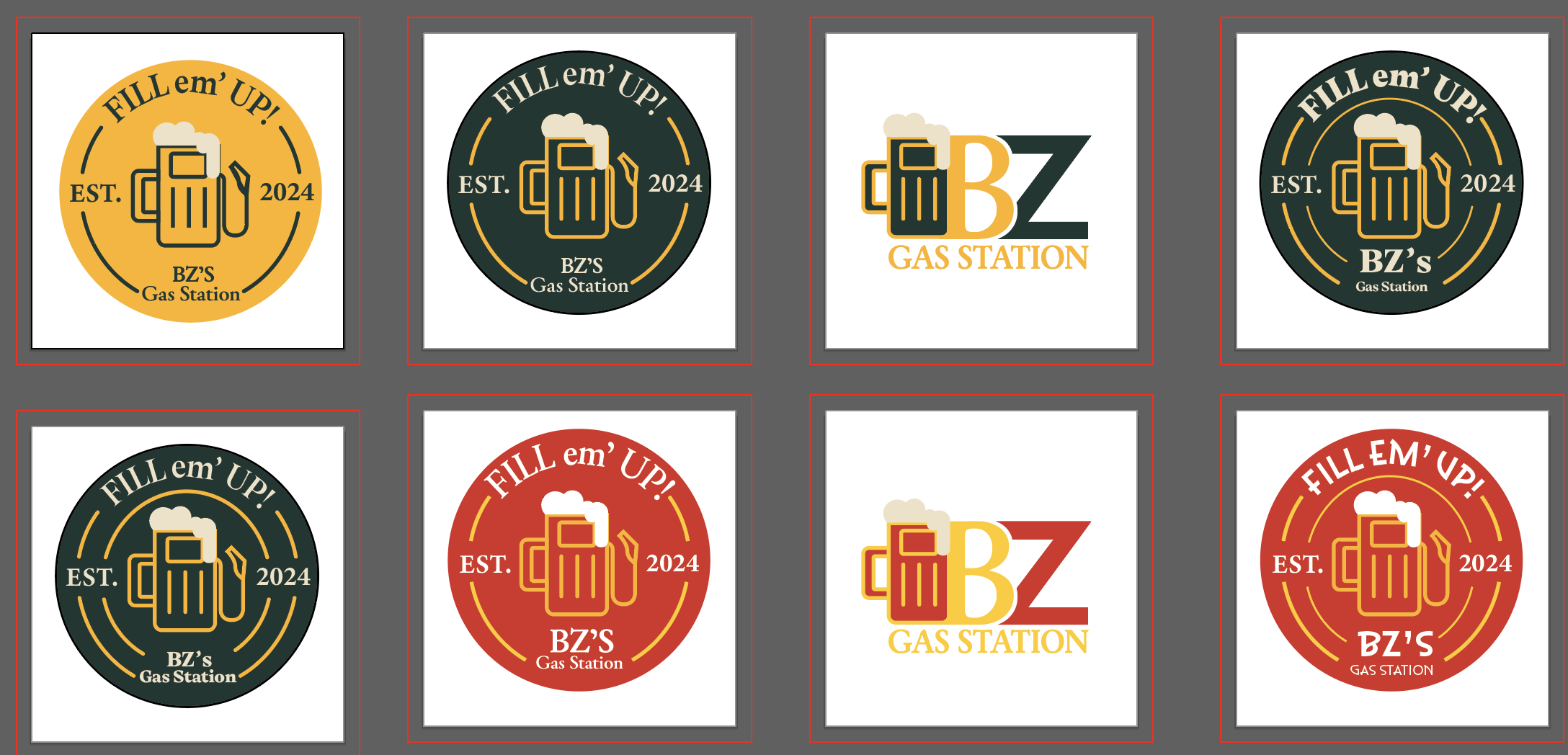
The main focus was the centerpiece for this logo which involves a gas pump and a beer mug being mashed together. This gave a fun feel while also being clean and creative enough to be eye catching. The color scheme was quite the debate as they wanted “Wisconsin team colors.” This gave me a lot of options and proved to be difficult when creating a final product. I ended up going with the Packers’ colors because they mesh really well together and the gold stood out amongst the bar.
Development:
I learned a great deal about communication with this project. The coordination between the client and I was something that I’ve never really had to consult before. Within my other professional activities, I was always given a starting point or some previous work to go off of but with this project it was starting from 0. This was both fun and challenging while also providing me a great skill for my future projects.