Mim’s Cafe
Objectives:
This project was a struggle for me; I had never done anything regarding brand design before this assignment. The goal was to take a local cafe or restaurant and turn it from "flab" into "fab." It was super great to learn how precise and careful you must be when creating a logo and other mockups for a restaurant and the sheer amount of work to be done just to change colors for a company is staggering. I enjoyed this assignment because it taught me more about the marketing world and how rebranding can change an entire company's future.
Strategies:
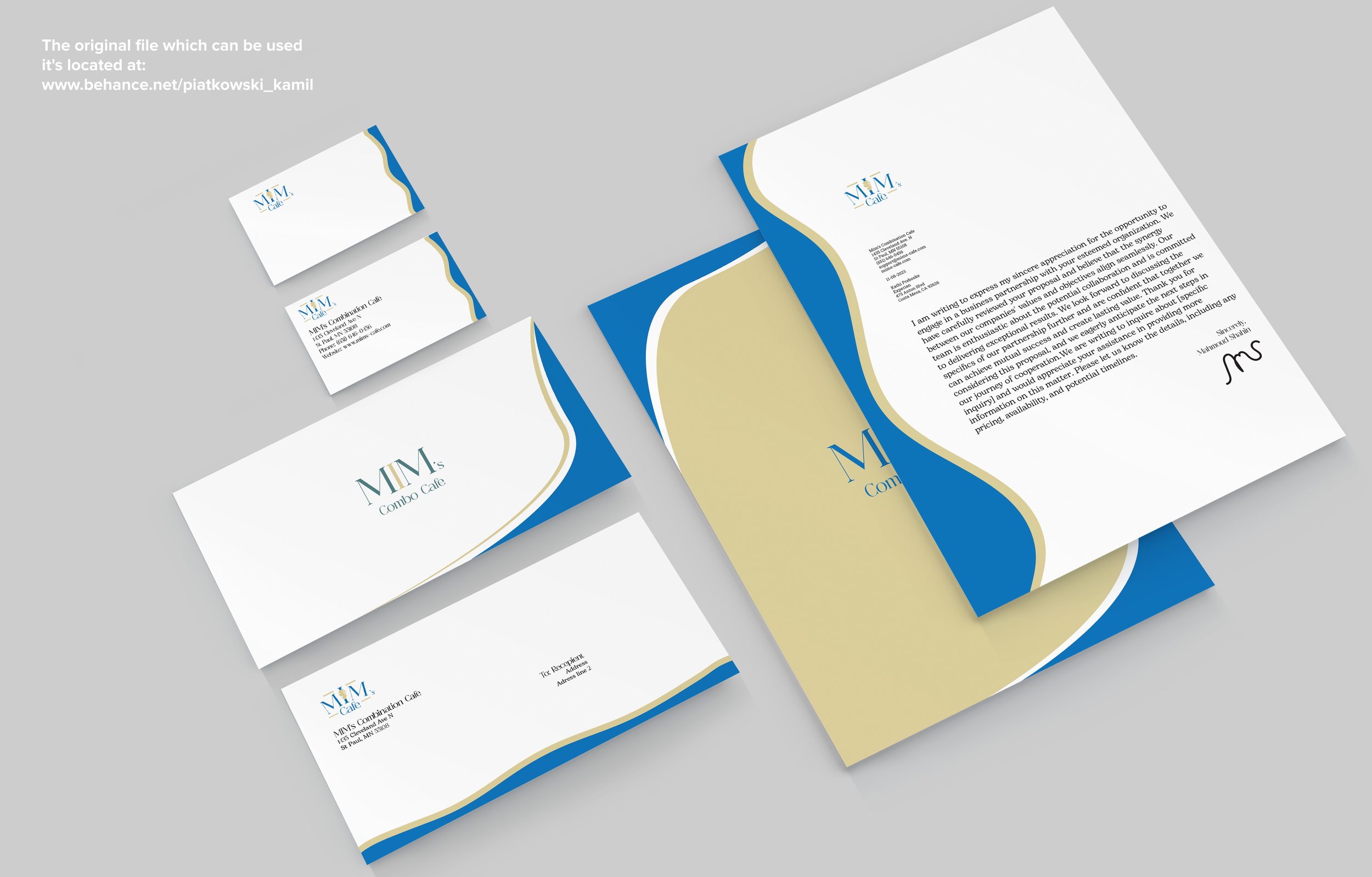
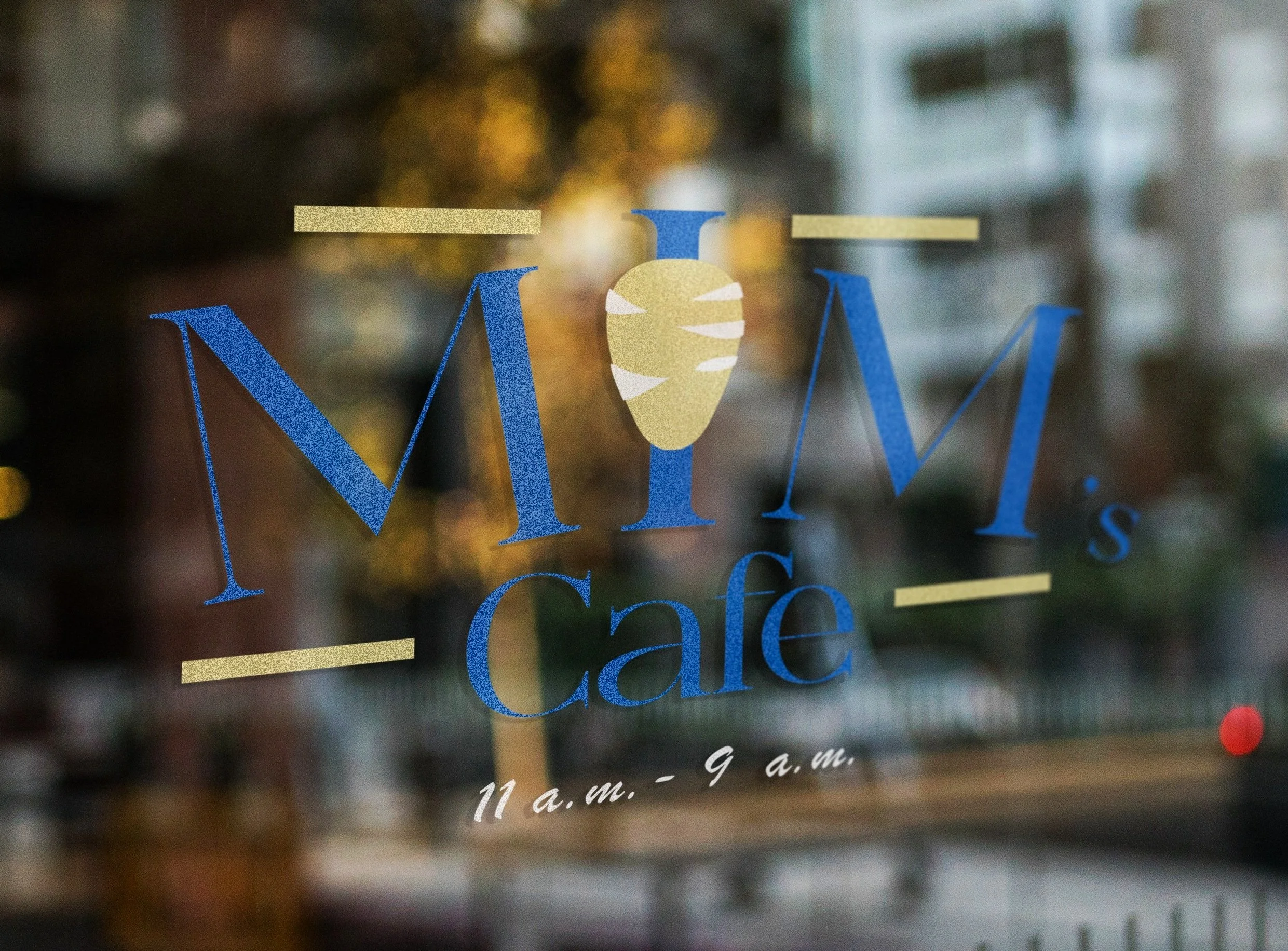
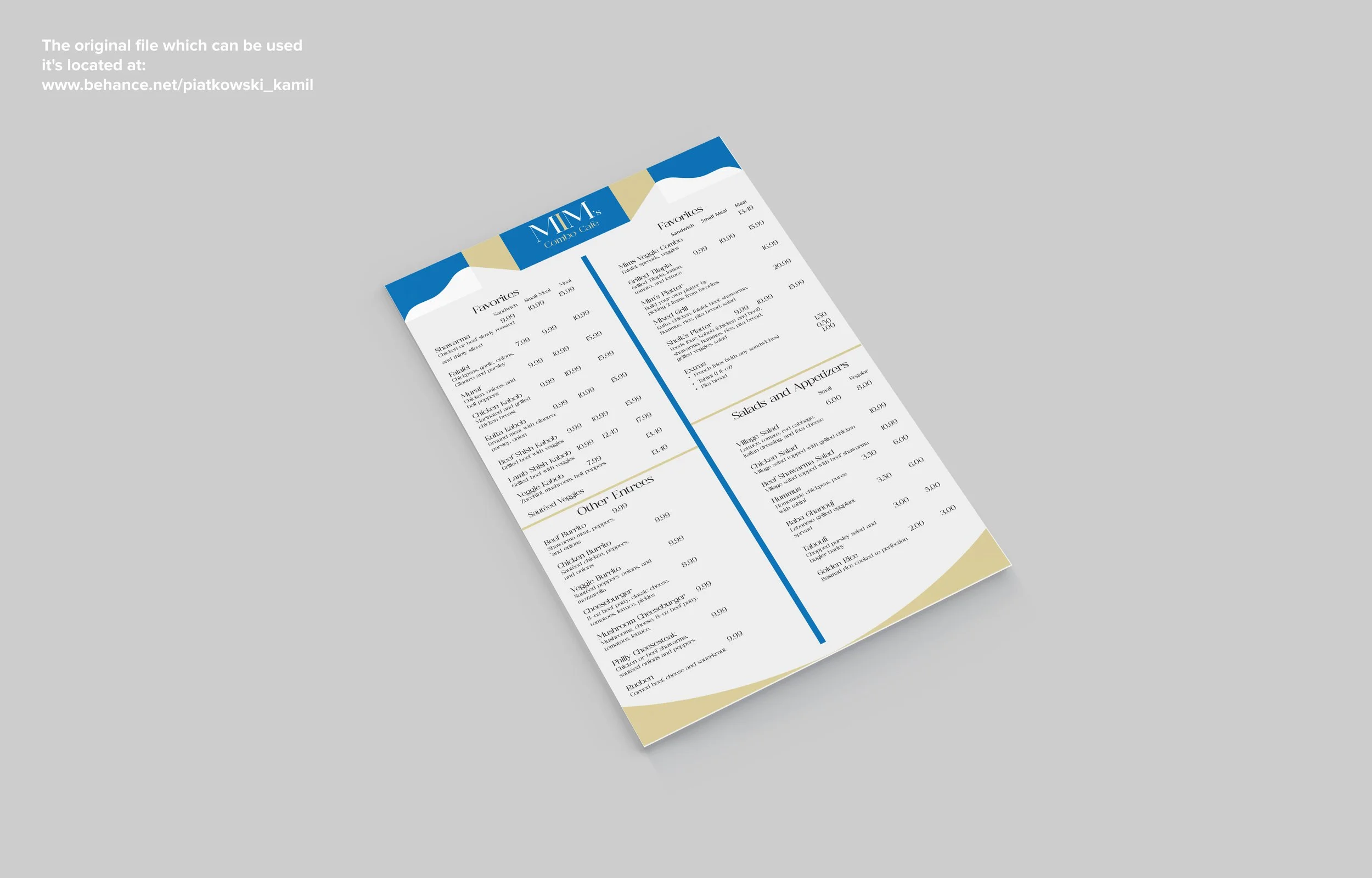
My primary goal with this redesign was to make it more Mediterranean so I changed up the color scheme to be related to the beaches and water of the Mediterranean sea. Coupled with flowing vectors that are almost wavelike and a Shawarma Kebab as the "I", I believe I turned Mim's overall tone into a fancier location.
Redesign evolution:'
After some very hard criticism out of the gate, I chose to redesign my entire brand set to achieve some new goals. I focused on a different color palette to compliment the Mediterranean food and changed the logo to be much cleaner.